Independent typeface · Display family · 2022
Jackerton 2.02.0
A cheerful display face built to connect, surprise and take up space.
- Role
- Type designer and creative director
- Scope
- Drawing, spacing, kerning, OpenType behavior and specimen design
- Character
- Playful, chunky, surprising and deliberately human
- Use
- Posters, packaging, identity, editorial and expressive digital display
The origin
Every word is a puzzle.
Jackerton is a playful, child-like typeface inspired by my father's doodles. Every word is a puzzle, with pieces changing and shifting as you type.
The 2.0 update
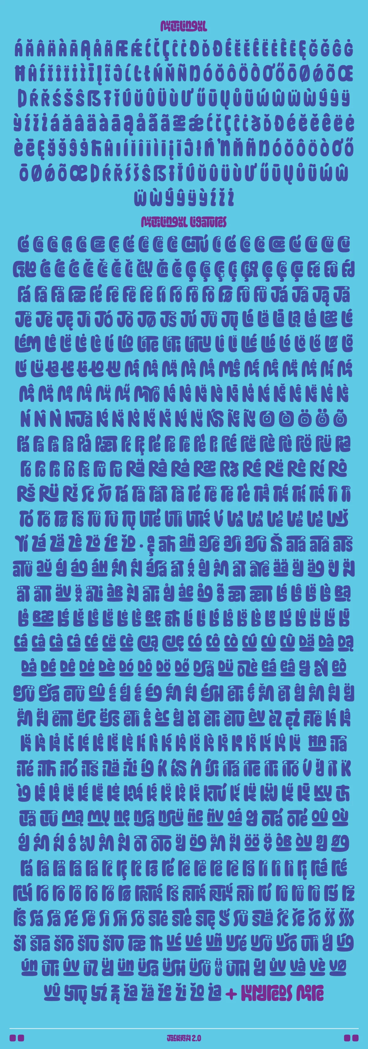
I scrutinized more than 50,000 words across over 100 languages so each combination could fit together precisely.
From caps to connection
One voice. Two kinds of energy.
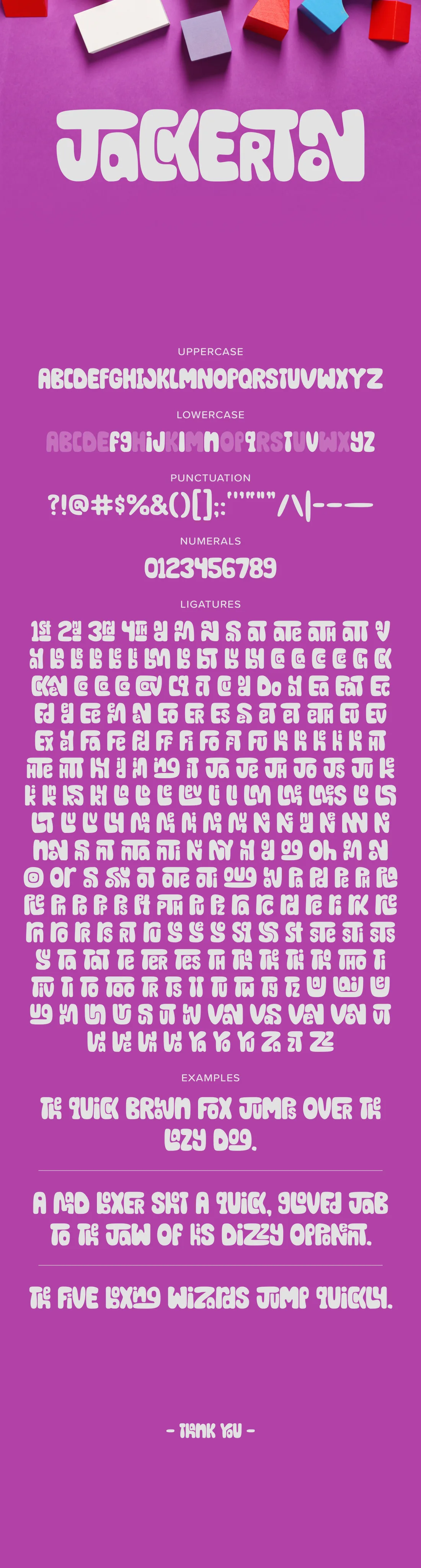
The uppercase lands like a poster. The lowercase moves like a phrase. Contextual alternates and ligatures let neighboring letters react to one another without sanding away the font's odd edges.
Type it yourself
Give the letters something new to say.
The tester keeps contextual alternates and ligatures switched on, so the lowercase can connect and change as you type.
Letters in motion
The forms change. The character stays.
Motion makes the font's puzzle-like construction visible. These original Pinterest studies build words one piece at a time, then push the same letterforms through candy, inflated and layered treatments.
Early applications
The voice already knew how to travel.
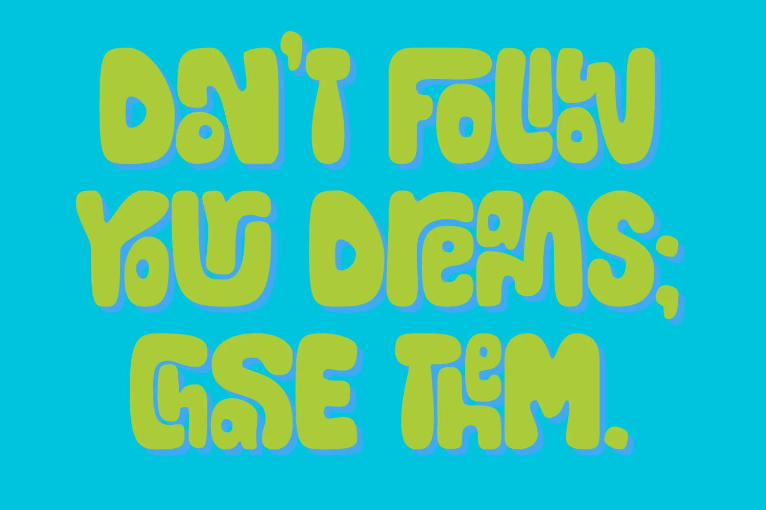
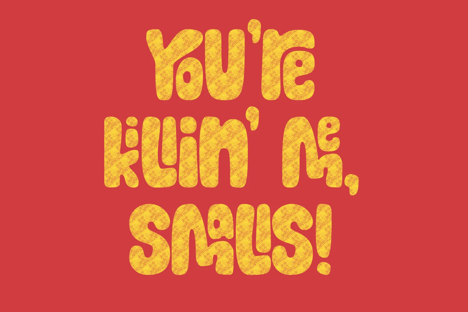
These original pieces show how quickly Jackerton can shift tone: buoyant, noisy, sweet or mischievous without losing its recognisable silhouette.
Then and now
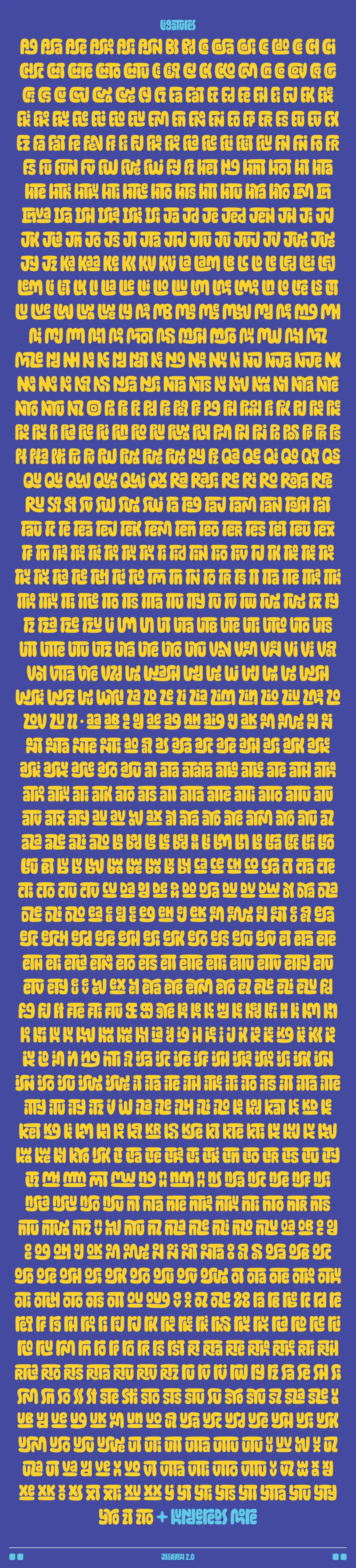
348 beginnings.2,425 new possibilities.
The outcome
More range. Same grin.
Jackerton 2.0 turns an expressive uppercase experiment into a flexible display family. The connected lowercase adds movement, the expanded set adds reach and the OpenType work helps all of that character stay useful.